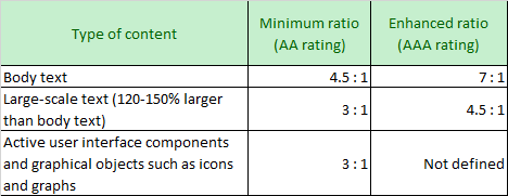
When designing readable interface then we need to take care of the contrast ratio between background and foreground color. Below table explain the contrast ratio suggested under the WCAG guideline.
Showing posts with label Contrast ratio. Show all posts
Showing posts with label Contrast ratio. Show all posts
View the contrast ratio of a text element with Color Picker in Chrome developer tool
The contrast ratio is a color property of a display system, that defined as the ratio of the luminance of the brightest shade to that of the darkest shade that the system is capable of producing. In the web world example, a text is written on top of any background(background could be either color or an image).
The contrast ratio is very important for accessibility. Some people with low vision do not see areas as very bright or very dark. Everything tends to appear at about the same brightness, which makes it hard to distinguish outlines and edges. The Contrast ratio measures the difference in brightness between the foreground and background of the text. If a text has a low contrast ratio, then these low vision users may literally experience the site as a blank screen, and can not read the text that is written on web page.
Chrome Color Picker
Google Chrome developer tool is very helpful to investigate and fix the contrast ratio on a web page using the color picker option of style. The Color Picker can help you make sure that the text meets recommended contrast ratio levels:1. Open the developer tool in the Chrome browser. (using option right click on page > inspect or pressing F12 button)
2. Click the Elements tab in developer tool.
3. In the DOM Tree, select the text element that you want to inspect.
4. In the Styles pane, click the color square next to the element's color value.
5. Check the Contrast Ratio section of the Color Picker. One checkmark means that the element meets the minimum recommendation. Two checkmarks mean that it meets the enhanced recommendation.
6. Click the Contrast Ratio section to see more information. A line appears in the visual picker at the top of the Color Picker. If the current color meets recommendations, then anything on the same side of the line also meets recommendations. If the current color does not meet recommendations, then anything on the same side also does not meet recommendations.
This is how we fix the contrast ratio issue for low vision people and make a web page accessible for all human beings. Hope this helps you to debug the accessibility issue related to the contrast ratio. please feel free to let us know your experience and if you know any other way to debug and fix the contrast ratio on a web page. Thank you!
References:
Subscribe to:
Posts (Atom)


